Every year, Pantone, the world renowned color authority selects a color of the year. In 2013, the color that was selected by Pantone was Emerald Green.
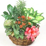
Emerald Green is a color of sophistication, prosperity, luxury and regeneration. Blue may be the most universally accepted color but green is the color that is most seen by the human eye. It’s abundant in nature. It relaxes the senses and helps us to slow down. It has been proven that when people are in nature, they become less stressed and more joyful. We see it in trees, bushes and plants.
Why the 2013 Color of the Year is a Good Thing
When a luxurious color like Emerald Green is chosen, it can be an indicator that the economy may be on the upswing. Since green and red are predominant colors featured at Christmastime, Emerald Green will be showcased more readily as part of clothing, accessories and interior design. With fall just around the corner, it will be featured in fashion collections for everyone. Unlike last year’s color, Tangerine, Emerald Green is flattering on all skin tones.
It also makes a great background color for accessories. It’s a playful alternative to black and brown for accessory colors. In makeup, it’s complementary to reds, pinks and oranges.
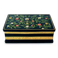
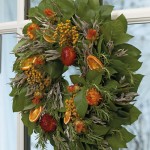
In the business world, it will be featured as a go to color for calendars, portfolios and business card cases which also make great Christmas gifts. It will be featured also predominantly in greeting cards this holiday. It will be prominently featured in gift wrapping as well. Additionally, you will see the brightness of Emerald Green blended in with the richer evergreens we see in our Christmas wreaths, trees and holly.
More Thoughts About Emerald Green
How do you plan on incorporating Emerald Green into your Christmas this year? Please share them with us below.


